
On Part II we covered how to build a common Design Language. On this one, we will cover how to construct a dictionary for your language. In Part IV (Bonus), we will cover how to share the dictionary and how to get your team to adopt it.
A dictionary is a collection of words that make up a language. In the design world this is called a UI Kit (although some people call it a toolbox). To compose a dictionary, you have to know what “words” you want to define. So start by making a list of all the UI elements you think you need in your product. These can be things like buttons, toolbars, navbars, input fields, and other elements that are specific to your product. Keep these in a spreadsheet and rank them by the level of priority so that you can focus on the most important ones first. Keep in mind that these elements are just a first stab. You will most likely identify more elements as you start composing pages.
The tool I currently use to create a UI kit is called Sketch App. It is the digital design tool of choice for most designers today. Among many features, this app gives you the ability to have reusable pieces of design called Symbols. If you are familiar with front-end engineering, you can think of them as coded presentational components for designers. In most cases, Symbols will have a 1-to-1 relationship to coded components for your product so you could potentially change style attributes in Sketch and affect the corresponding component in your product. However, that is a post for another time — check how Airbnb is doing it here.
If you are not familiar with Sketch App, I would recommend for you to watch some tutorials before diving into creating a UI Kit. Pablo Stanley has awesome material on this on his Youtube channel.
The Design Goal of the UI Kit is to communicate what UI elements are available for use by the designers. However, the Business Goal of the UI kit is to save time, avoid ambiguity and subsequently save money.
Structure
The way I structure my UI Kit file is by defining a couple of pages that help the Designers navigate through the document. I use pages to describe each of these:
- I. Welcome | Get Started — Introduction of the UI Kit. What it is and how to use it.
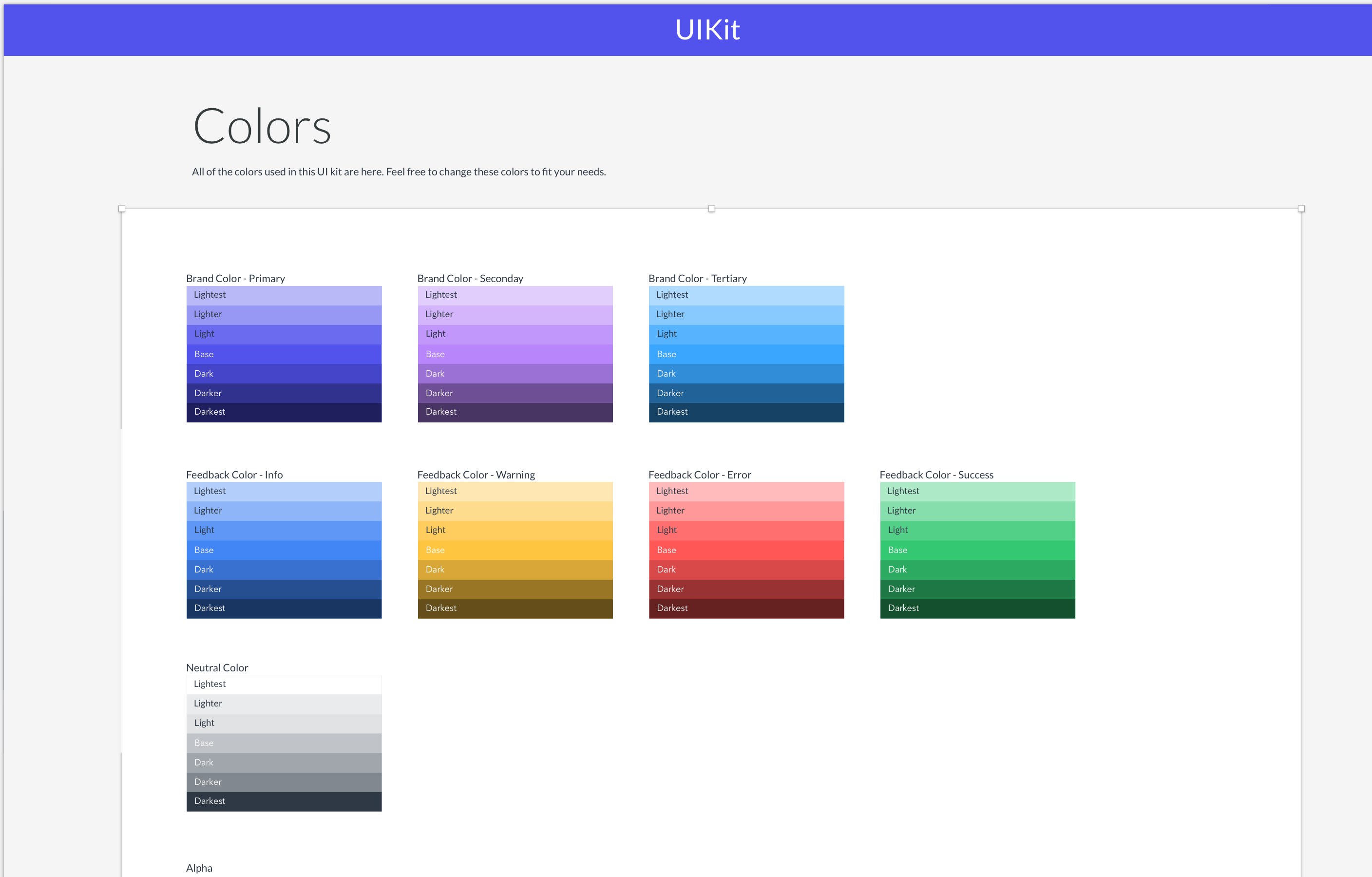
- 1) Color: Our color palette includes the shades and tints for every hue.
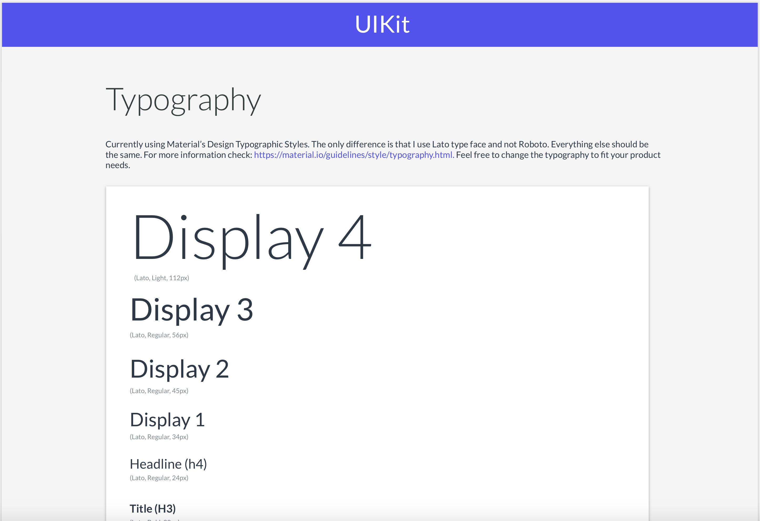
2) Typography: All of the Typographic styles available for use.
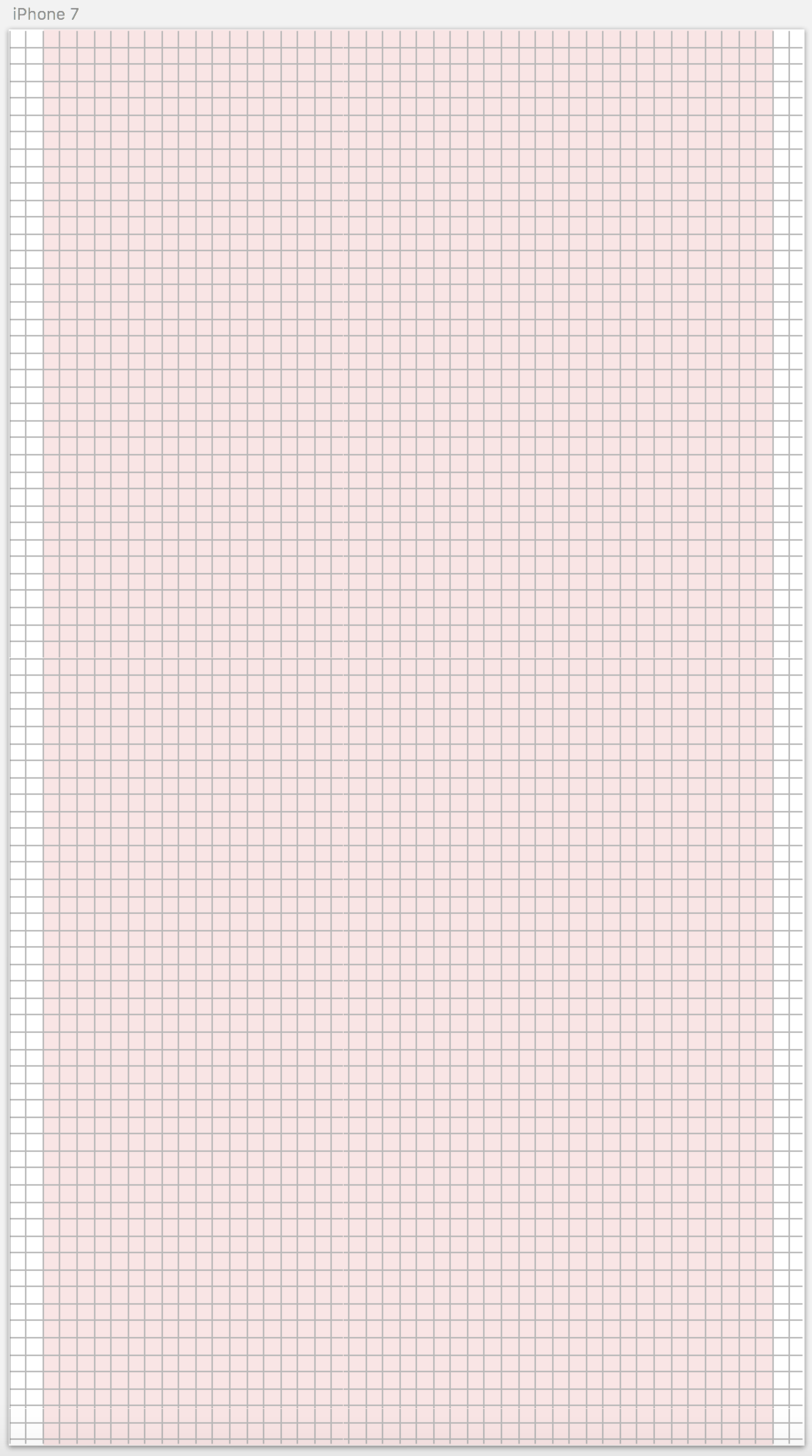
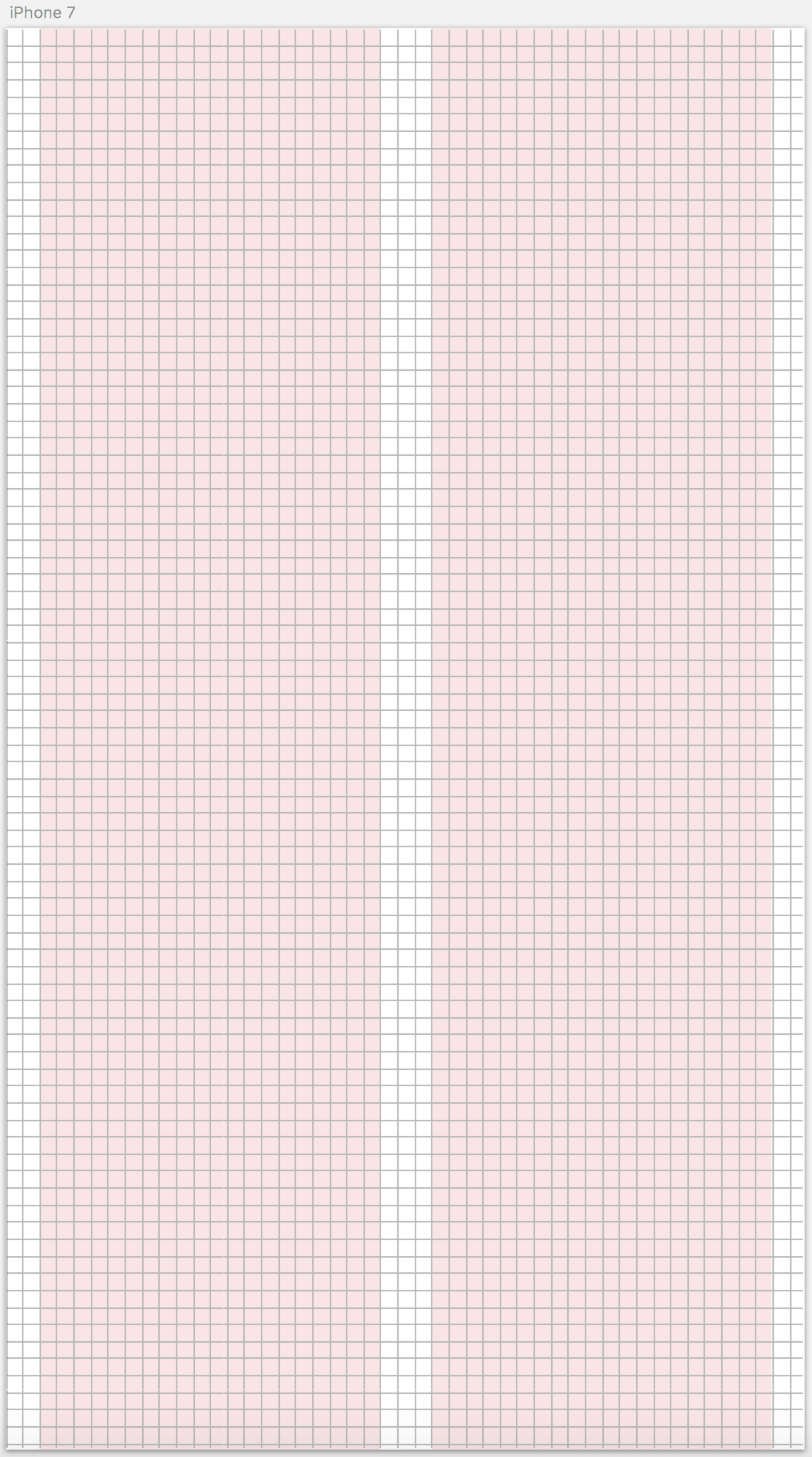
3) Space: Explanation of the 8-point grid system and mobile layouts.
4) Depth: Specs for box shadows.
5) Style Guide: A collection of all the UI elements grouped by type or context.
6) Templates: Templates of pages created as Symbols for your convenience.
7) UI Elements: “Kitchen Sink” of all of our UI Elements for design - II. Symbols — Go here and modify the elements to fit the look and feel of your product.
- III. ✍🏼 Workplace— A place for you to play and construct screens with the UI Kit elements/symbols.
Setting up the Foundation
You want your UI kit to scale upward. Since all of the UI Elements you will create are crafted out of the same anatomy (typography, colors, space, iconography, etc), your chances or scaling your UI cohesively are automatically enhanced. There are many ways of starting a UI Kit however, this is the way I like to do it:
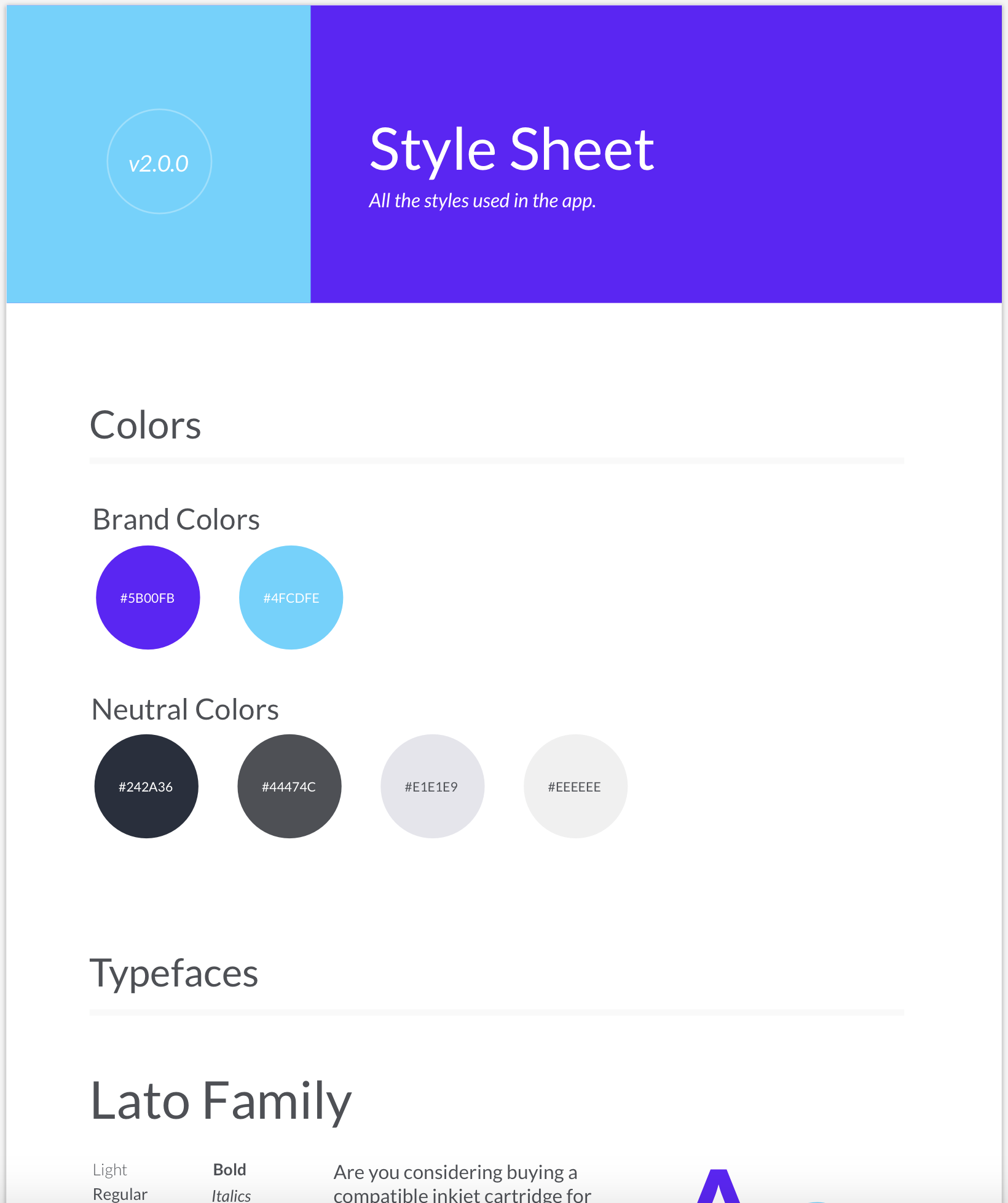
1. Create a Style Sheet
2. Color: Create Shared Styles in Sketch App for all of the Hues (base colors) in your Style Sheet.
Create a Symbol for each hue. Make sure they are all the same dimensions.
3. Typography:
Declare all of your Text Styles
4. Iconography:
You can use free icon sets to get started however, I highly encourage you to create your own. This way you iconography will be unique to your product.
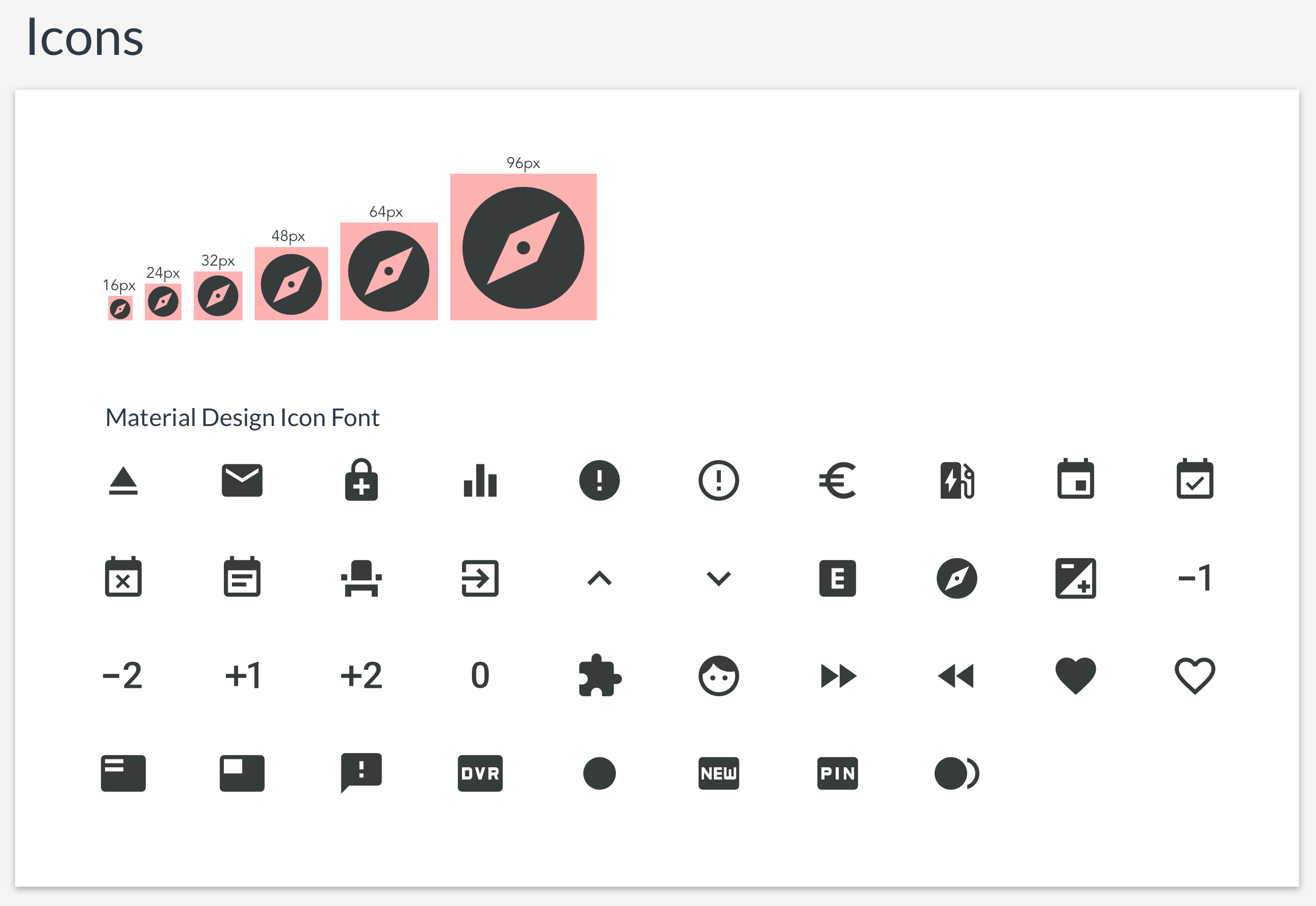
When possible, try working with SVG’s as they are better than Icon Fonts. See this really good article comparing the two.
5. Space:
Declare your grid system
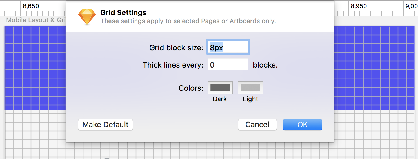
Declare your layouts
Declare your layouts
This will depend on the type of platform you are designing for since each layout will be different for each platform. Make Symbols for each layout.
6. Depth:
Create Shared Styles in Sketch App for all of the types of box-shadows you will have in your product.
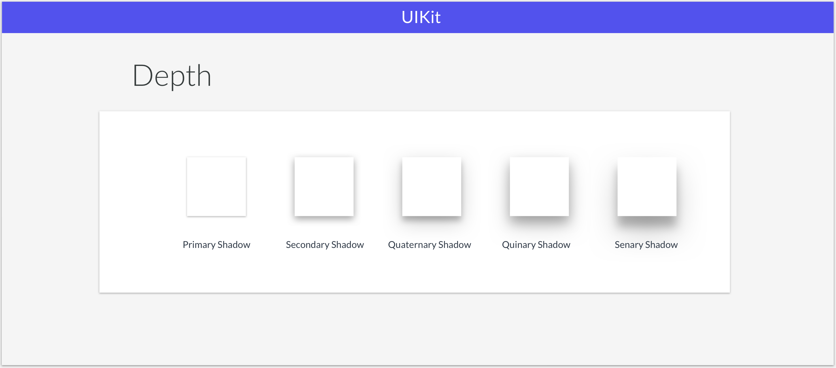
Create a Symbol for each box shadow. Make sure they are all the same dimensions as well.
Note: Keep in mind that the Style Sheet is meant to be a starting point. You will most likely iterate as you start composing UI Elements and pages. That is totally ok since a Design System is a living organism, remember? Iterations will happen you need to be ok with that.
Making UI Elements
Once you have layout the foundation of your UI Kit, it is a matter of just grabbing the symbols you created for Color and Depth, adding the defined Text Styles and Icons and making sure that all of these snap into the 8-point grid system.
Note: When composing elements, try to think about how that element will be coded. All UI elements should have a background color defined. So does the UI element you are creating in design. You can think of them as Containers or "<div>'s".
That is it. You can now start creating UI Elements that will be consistent! Always remember: Developers will always code what you give them. So your Design System and the elements in your UI Kit should be consistent. In the next post, we will talk about how to share your Design System and UI Kit with your team.
I am a big believer in giving back to the community so I created a UI Kit that you guys can use for free. It is already packaged with everything you will need including fonts, icons, images, illustrations etc. If there is enough interest, I will make one for Responsive Web. Let me know if you guys would be interested.
OSKRHQ Mobile App UI Kit. Here is an example of what you can create with this UI Kit…
