
This post is Part I of a series of blogs I am writing about Design Systems and how important they are for UI Design and Development.
Anatomy simply describes the dissection and the separation of parts, particularly, of living organisms. User Interfaces are just like living organisms. They are born from inception, they grow as Designers learn more about users, and they die to give room for more contemporary patterns. Therefore, if UI is a living organism, we should be able to dissect its major parts.
Every digital screen you see is essentially composed of the same 4 parts: Color, Typography, Space, and in most cases Iconography. Of course there could be more parts in a UI like sound, depth, and motion but these 4 are the most important ones. No UI elements can exist without these. So, if you are able to define these early in your design process, you have a better chance of creating interfaces and experiences that feel like they belong to a bigger purpose — your Brand Identity.

Let’s look closely at the example above. A simple button right? Now, let’s dissect its parts.

You can start seeing how they play together, right? Now, let's introduce system for space that gives us a flexible and responsive way of composing each element regardless of the screen dimensions.
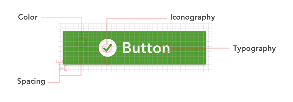
I use an 8-point Grid System for this. Essentially, this means I use multiples of 8 to define dimensions, padding, and margin of both block and inline elements. This automatically give you a more cohesive layout. Elliot Dahl did a great post about this. You can find it here.
Now open your favorite app in your phone. You will see exactly the same four parts we talked about throughout the whole UI. This is because whoever is coding that page you are looking at had to declare all of those parts via CSS declarations. This is important because most designers do not know this crucial fact of development and end up giving devs designs specs that do not have consistent values. This leads to an inconsistent UI and fragmented experiences.
Always assume that your devs are going to code exactly what you give them. So if things are not cohesive it’s probably your fault. Not theirs.
All front-end devs have to declare padding, margins, font-size, font-weight, color, background-color, etc in their markup. Therefore, it is of huge help to devs if you come up with a systematic way for declaring these values. I use something called Design Tokens to help me with this process and then I compose a Sass file which all my components consume. A front-end dev can help you with this if you are not familiar with Sass. I will do a blog post soon about Design Tokens but you can read more about them here.

In conclusion, try to start composing your UI with a framework that allow you to scale your UI outward. You can always change the values (hues, typographic styles, icons), but you should always have a framework. This framework is called a Design System.
Design System (noun): A product made of living guidelines that communicates a unified set of UX and design decisions which promotes harmony across various media outputs.
In Part II, we will dive deeper into Design Systems and how to compose one. Part III will be all about sharing and scaling your Design system amongst your design and dev teams.
